Making payments easier (on the eye)
In a nutshell
Neat is* a Hong Kong based cross-border payments platform for SMBs and startups. I joined Neat as a Senior Designer on the Growth team to further define and evolve the brand’s application beyond their existing guidelines.
In true start-up fashion my role at Neat very quickly became twofold, with my work on the visual identity leading to opportunities to design for the product too, and so I had the unique opportunity to straddle both UX/UI and brand (which is where I fell in love with working at this intersection, but more about that later).
I was Neat’s 6th UK hire and the business was around 50 employees, with founding team members who felt very close to the product and the recently finished rebrand. However there was a clear gap in terms of how best to apply the new identity to create assets that were visually compelling, and suited to business needs.
*The Neat brand (and my role) sadly came to an end in 2023 shortly after the company was acquired by Rapyd.
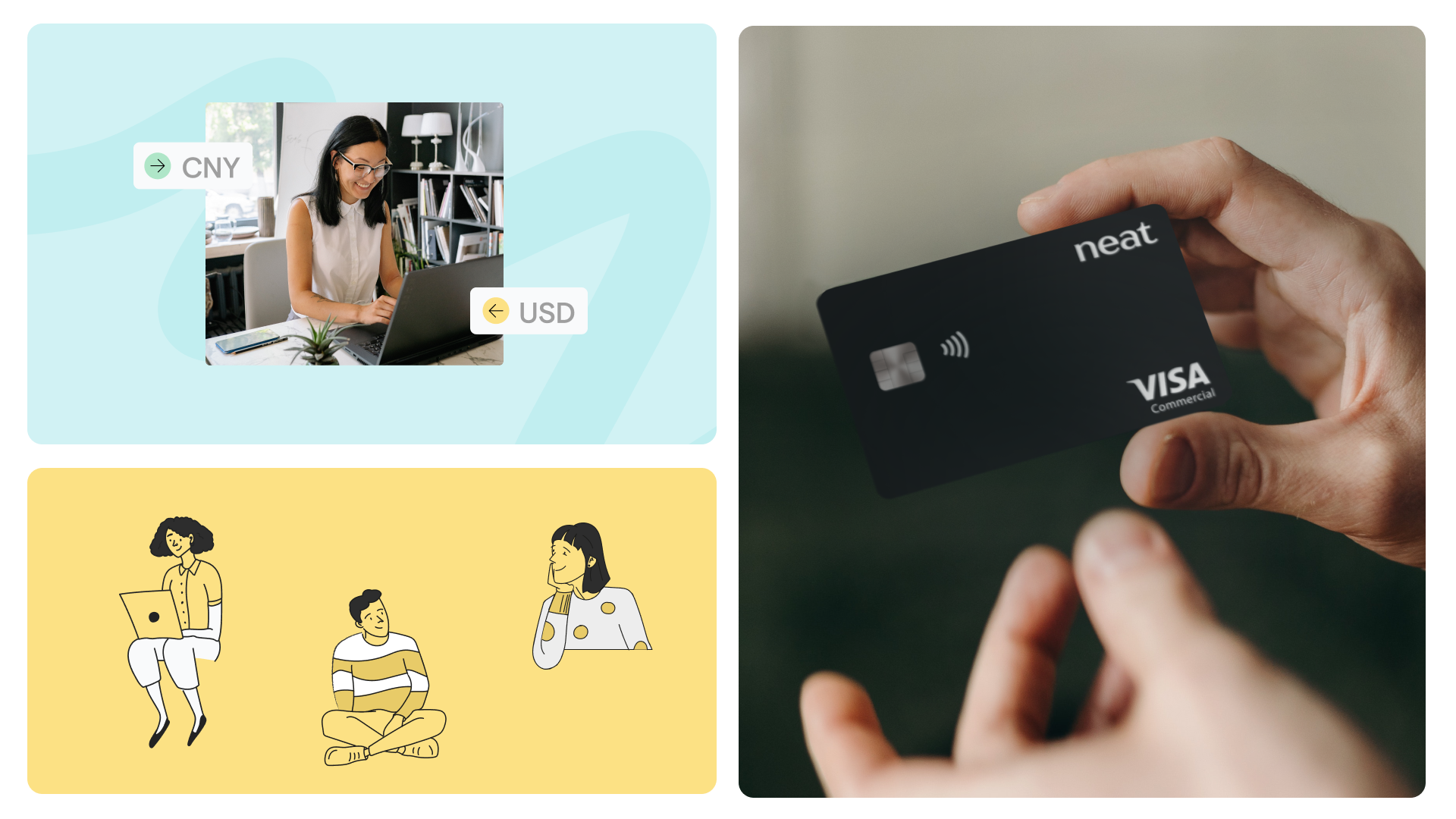
Above: A peek into Neat’s brand world when I joined
The journey
My challenge was to be a brand guardian, to champion the product as the hero of the brand and create structure around how the identity should flex across digital formats while maintaining design standards.
This was a large, ongoing challenge that spanned multiple touchpoints and platforms. To cut a long story short, working closely with the Product Design Lead and the Head of Growth I…
Interviewed Internal stakeholders to understand how Neat viewed its competitive landscape, where the brand aspired to be, and how creative could better reflect product value.
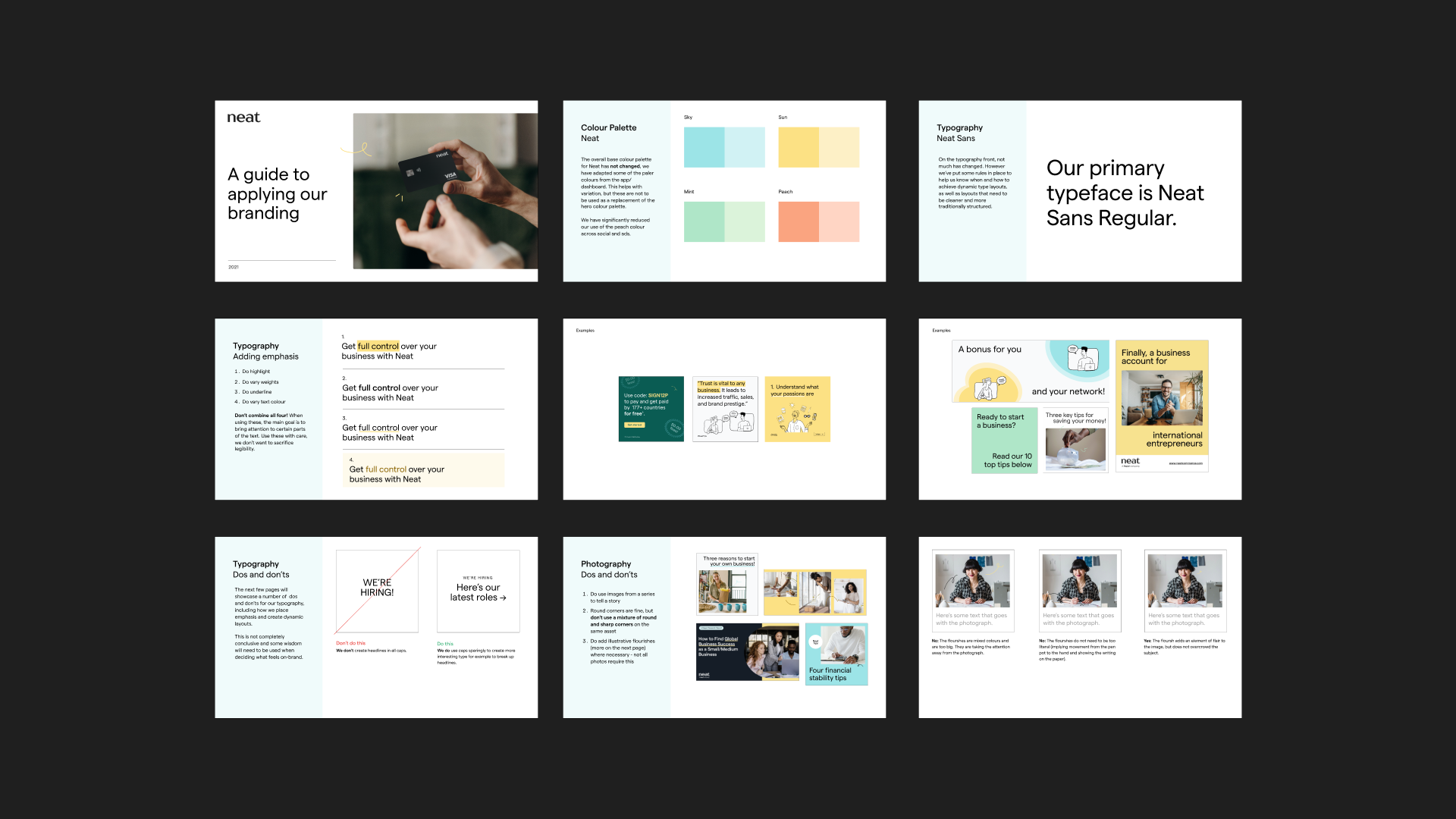
Developed a more easily accessed, living brand guardrails doc in Figma providing structure and direction on how to apply the visual identity across digital with clear examples and best practices.
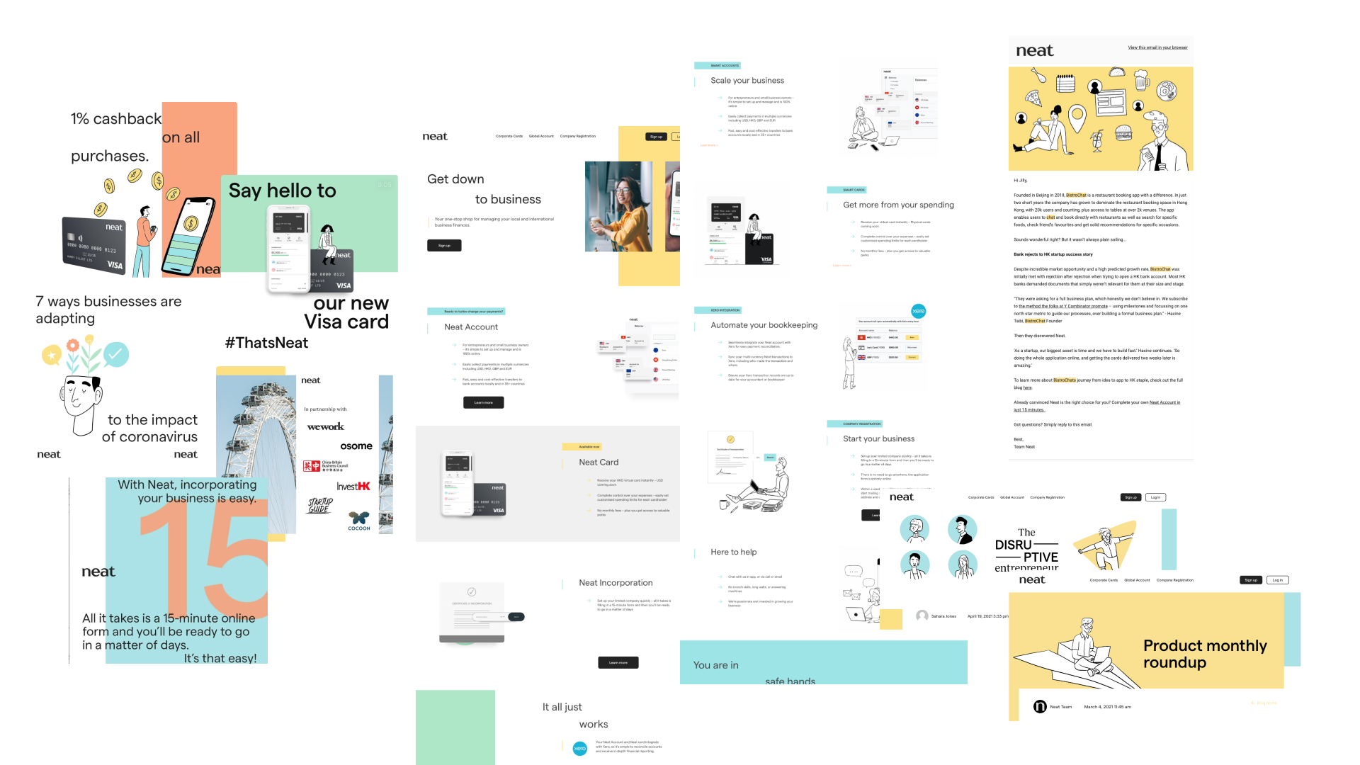
Built a library of UI-based illustrations that could be reused across channels to create consistency and elevate product visibility.
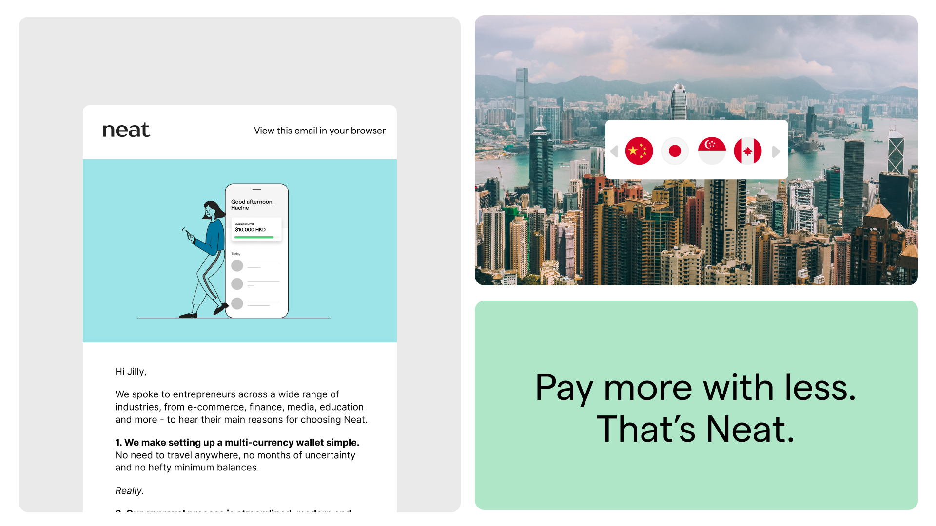
Introduced a light-touch animation direction to enhance key marketing materials — from email headers to social assets — helping bring more energy and engagement to static designs.
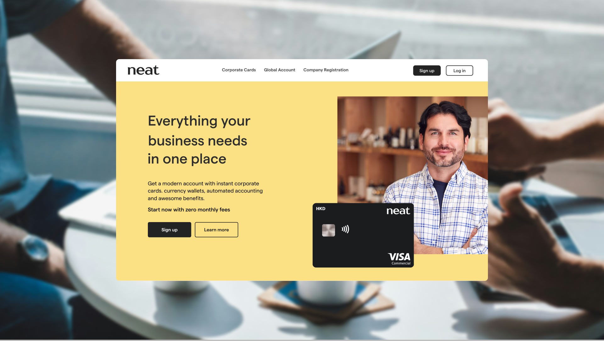
Led the redesign of the website’s three most visited pages, including the homepage, driving product sign-ups.
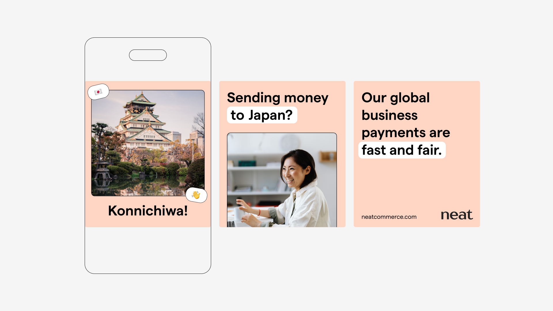
Pushed for more use of UI-based illustrations, more lifestyle photography, and a general shift to do more storytelling with our visuals, allowing customers to see themselves within the marketing.
Helped empower Marketing to self serve through the use of Canva templates.

And as a result…
Refining the visual identity and implementing consistency was part of a much larger strategic growth plan. This meant the guardrails I put in place and assets I created contributed to key projects including: the launch of Neat’s Business Cards, the launch of payments to over 170 countries, and the launch of dashboard onboarding tours.