In a nutshell Savills Investment Management (Savills IM), leaders in the real estate industry, wanted to amplify their message of change, and so they approached Clear with this challenge; how to bring their new positioning to life in a way that felt clear, consistent, and confident.
The Journey This was my first project since joining the Clear design team and much of the visual language had mostly been defined by the ACDs. The design thinking behind the new Wave symbol and its potential to breathe new life into Savills IM’s comms was all set, and key stakeholders were on board. With presentations showcasing how the brand could work all approved, it was now time to create real-life brand assets, identity guardrails and begin preparing for final asset handover.
I took the lead on…
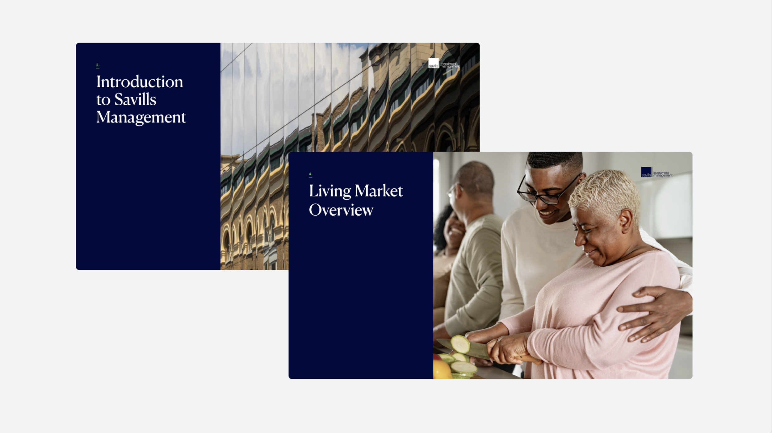
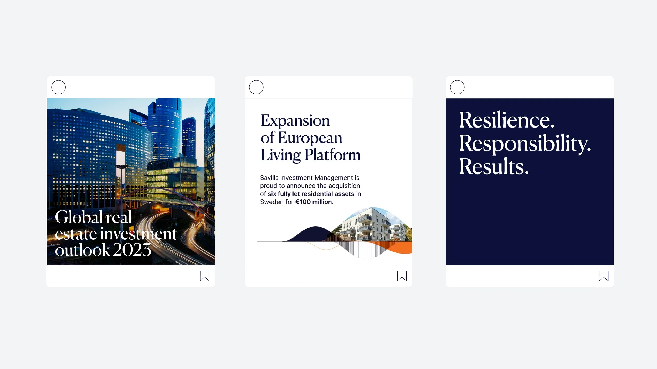
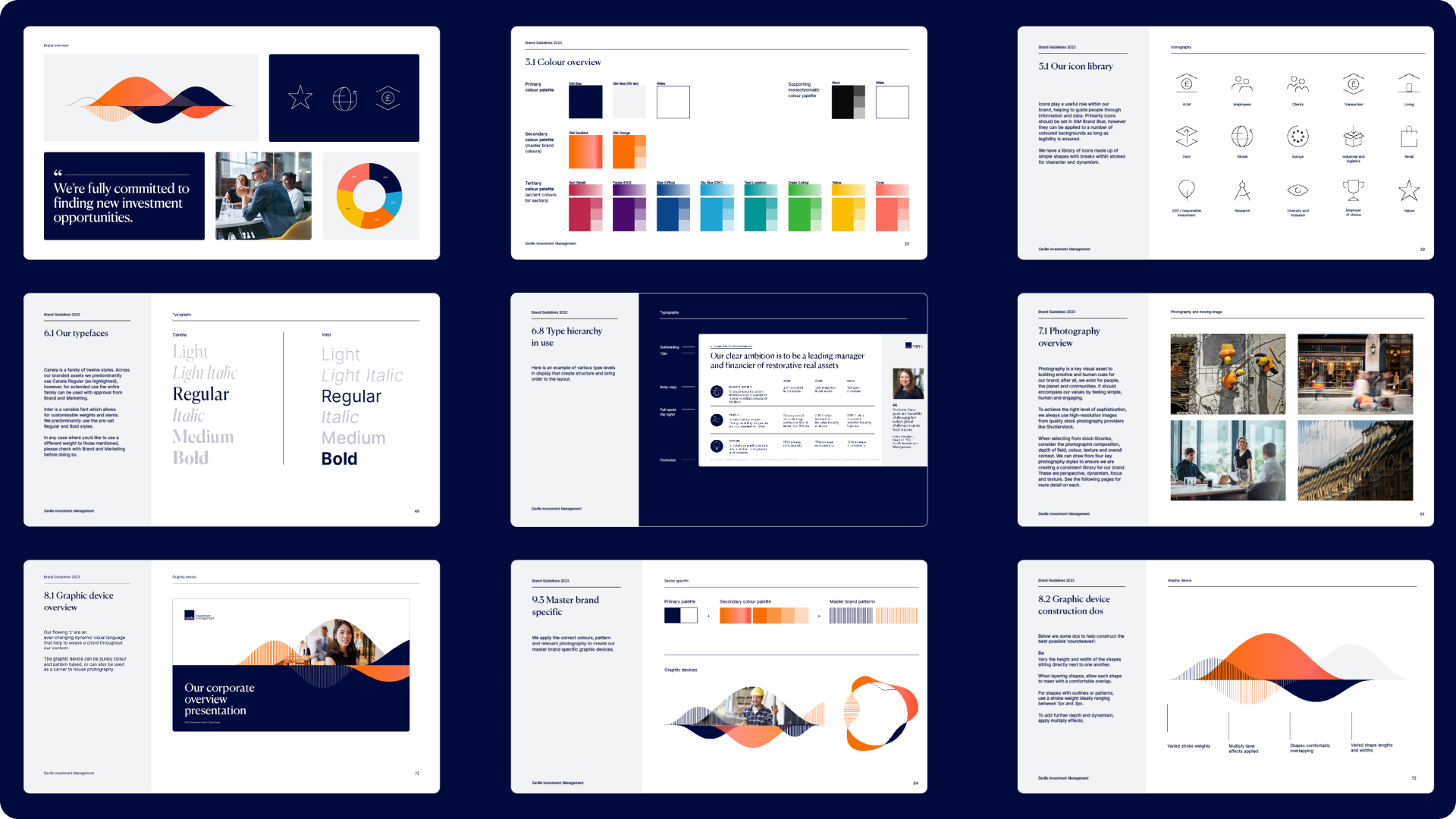
Creating the guidelines for the visual identity with best-in-class examples and guardrails to ensure consistency across every expression
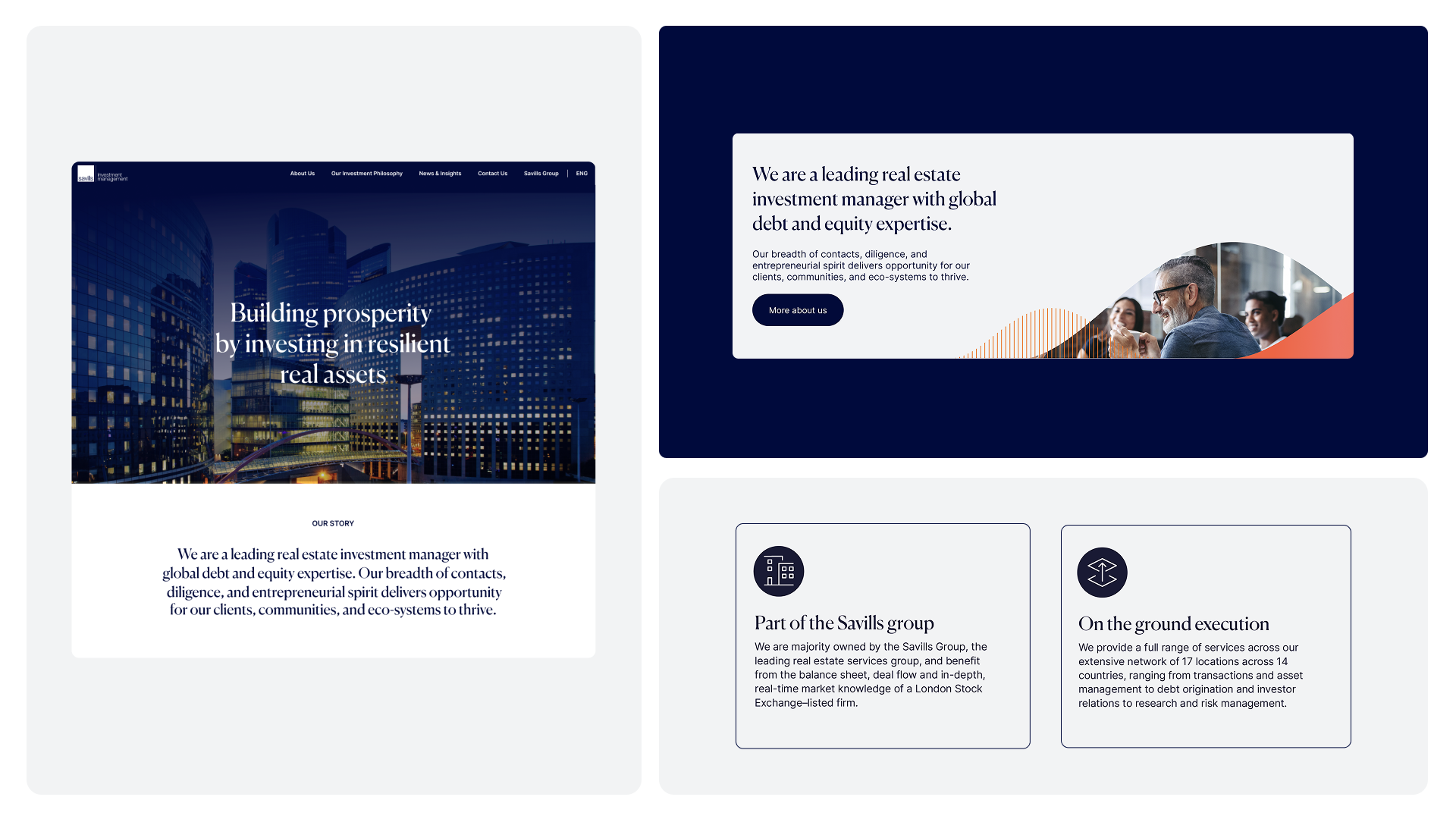
Redesigning the most visited pages on the Savills IM wesite showcasing how the new identity comes to life across each page, with new components and UX/UI best practice at the forefront
Conducting training to over 150 Savills IM employees on Zoom outlining the core building blocks of the visual identity and how to apply it when creating PowerPoint documents
Creative direction for the brand launch video, collaborating closely with our motion designer
And as a result… The brand identity was officially launched in 17 locations worldwide in June 2023. Marking the beginning of a comprehensive plan aimed at ensuring a consistent roll-out across the entire organisation.
Credits: Associate Creative Directors: David Moore, Clare Wright